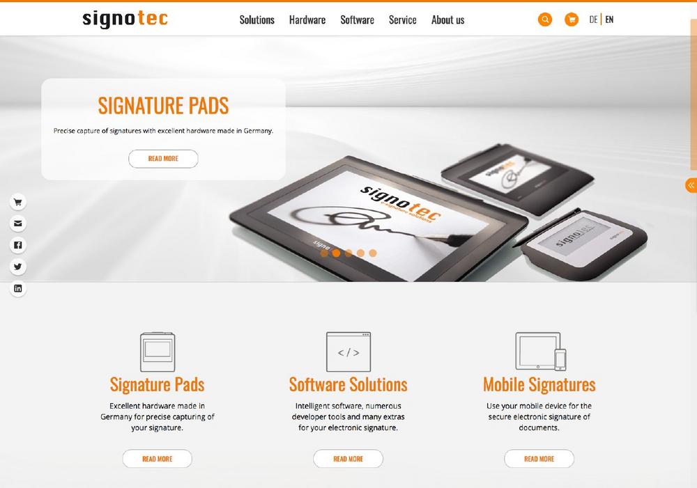
signotec is the market leader for solutions in the field of secure handwritten electronic signatures and offers hardware and software from a single source. Since May 20, 2019, the company has been presenting itself on a new, modern website that focuses on the fast and targeted accessibility of information. When opening the start page, which is – exclusively visually – similar to a one-page design, the title slider with large-format graphics immediately catches the eye. Important subject areas are displayed on this and can be accessed via the "Learn more" button.
The information blocks below immediately lead to the core competencies hardware, software and mobile signing. Via the so-called "Sticky Navigation", an access bar on the left side, the web shop, the contact page as well as the social media pages open with a single click. A prominent element of the home page is the "News" box, which can be folded back in by clicking on the two arrows. New is also the mega menu, which unfolds itself by mouseover over the five main navigation points. A special highlight here is the icon-imaged overview of all signature pads in the hardware area. In the menu, all sub-items of the respective navigation point are displayed at a glance, so that the user can quickly find the information he is looking for. For better orientation, the navigation on most subpages is additionally displayed on the left side.
The product pages for hardware and software have also been intensively revised. In terms of content, the focus here was on providing the customer with comprehensive and up-to-date information on the desired product. The resulting depth of information is absorbed by a structured layout. Thus, the introductory information text, which is initially only shown in the initial outline, can optionally be expanded or skipped by pressing the "Read more" button in order to get straight to the technical highlights.
The page is programmed in the so-called "responsive" design, so that it can be optimally displayed on any mobile or stationary device.
Despite all the innovations, great importance was attached to the recognition value of the page for the customer. In accordance with the corporate design, the new website also features a very clean style with lots of white space, the logo colours orange and black as well as expressive image material.
signotec GmbH
Am Gierath 20b
40885 Ratingen
Telefon: +49 2102 53575-10
Telefax: +49 2102 53575-39
https://www.signotec.com/
Telefon: +49 (5074) 96727-42
Fax: +49 (5074) 96727-69
E-Mail: silke.schomburg@signotec.de
![]()
